Norway shows new banknotes
 This week we've seen some excitement in the world of banknote collecting because the Norges Bank 'unveiled' the design for the new banknotes. Yes, again. Because if I recall correctly (and yes I do) I already wrote in this post from 9 October 2014 what the new banknotes of this series would look like.
"On each obverse side, the designer has placed a signal flag from the maritime alphabet. The flags represent the letters N, O, R, G and E and therefore spell either NORGE or NOREG (not in order by denomination).
The cubic patterns on the reverse side represent pixels and mosaics. The patterns depict the coast, the horizon and the motif. The organic pattern is an abstraction of the sea. Both the cubic and organic patterns follow the Beaufort scale as an expression of wind speed. This affects the waves in the sea. On the lowest denomination note, the wind is light, and there are short cubic forms and long, gentle waves in the organic pattern. On the highest denomination note, the wind is strong and creates elongated rectangular forms and short waves."
So sure, I can show the designs again because they are quite original and really stand out internationally. Do I also like them? Well, I know some people are going absolutely mental over them and call them the future of banknote design. I guess that makes me an old fart because I'm not very impressed. Sure, the pixelated back is very original but also looks like something I could have made myself. And I suck at Photoshop. The front of the notes is more to my liking but is also rather simple and minimalistic.
Perhaps the note will look better in real life and beauty is of course (as always) in the eye of the beholder but I won't be standing in line to get these for my personal collection I think.
50 kroner
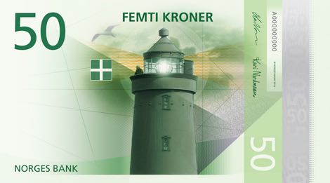
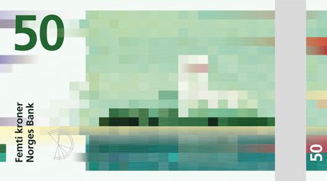
Front: Utvær Lighthouse in Sogn og Fjordane, Norway's westernmost point. Signal flag: Letter R. Back: Pixel motif on the horizon: lighthouse on the horizon. Cubic pattern: 1.6 metres per second. Organic pattern: Light breeze, gentle waves.
100 kroner
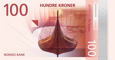
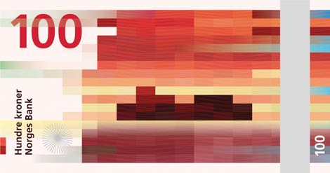
Front: The Gokstad ship from the 800s, with the Norwegian-designed X-Bow hull developed by Ulstein Design & Solutions AS in the background. Signal flag: Letter O. Back: Pixel motif on the horizon: Cargo ship. Cubic pattern: 3.4 m/s. Organic pattern: Gentle breeze. Crests begin to break.
200 kroner
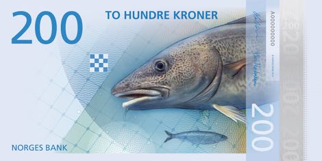
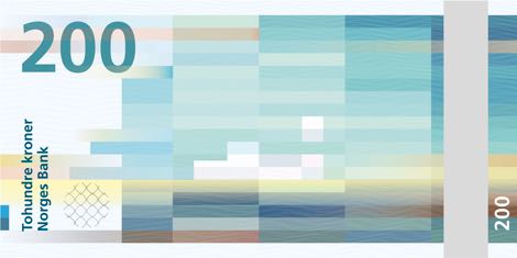
Front: Cod and herring. The background drawing shows mesh from a fishing net. Signal flag: Letter N. Back: Pixel motif on the horizon: Fishing boat. Cubic pattern: 8 m/s. Organic pattern: Fresh breeze. Wave heights of 1 m or more.
500 kroner
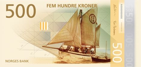
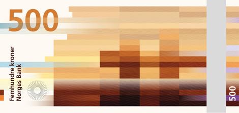
Front: Colin Archer, boat design. Anders Beer Wilse, photographer. Linn Krogh Hansen, photographer. Signal flag: Letter G. Back: Pixel motif on the horizon: Oil platform. Cubic pattern: 13.9 m/s. Organic pattern: High wind. Sea heaps up, white foam from breaking waves.
1,000 kroner
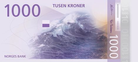
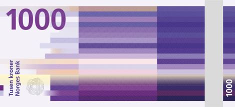
Front: Motif: Wave in the sea. Signal flag: Letter E. Back: Pixel motif: Horizon. Cubic pattern: 20.8 m/s. Organic pattern: Strong gale. High waves. Dense foam is blown along wind direction.
Geen reacties